Print, video, sounds

Comparator chip spreadsheet

This spreadsheet compares speed versus current of comparator integrated circuits. pdf version
Comparator-IC-chip-chart
In 2010 I tried to convince my company that engineers would love a spreadsheet that would let them sort filter and compare various IC chips. All companies want to do is web tools that hide raw data. Trying to sell the idea I made this spreadsheet using data I copied off the web. I can't guarantee accuracy.

Some companies like Maxim will let you download a spreadsheet now. I guess some people listen to their customers. It took a while to realize that engineers are unique in that they use spreadsheets as much as the CEO. Thing is
the web groups tend to be Marketing people that have no idea how comfortable engineers are using spreadsheets. Since marketing people don't use spreadsheets they don't understand the value.

I made charts of the data to help you understand the range of the parts. The lede picture shows the various companies' parts on one page. Faster parts are on the right, with higher power consumption towards the top. Parts n the bottom edge of the distribution are remarkable for using less power at speed.
Bottom of first columnmove down to the left

Analog-Devices-comparitor-chart.png
.
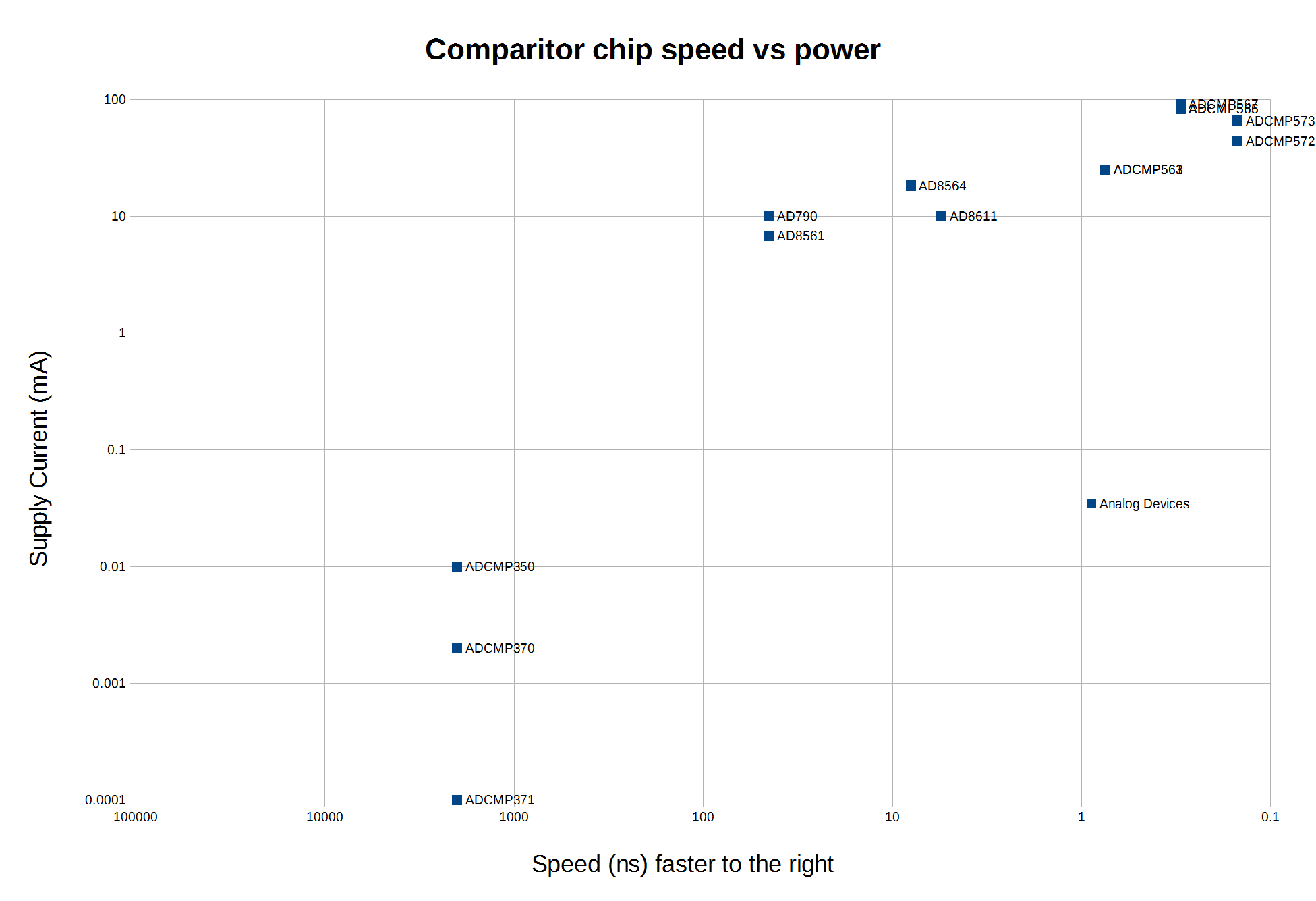
This chart shows Analog Devices comparators. You can see ADI has the fastest chip, and that that speed requires a significant amount of power. You can also note they don't offer dozens of chips, just ones targeted for specific applications.

Linear-Technology-comparator-chart.png
.
This chart of Linear Technology's chips show they are not as fast. The chart makes clear LT's strategy. They make fast chips and low-power chips. They ignore the more mundane middling performance chips, which tend to be low-profit "jellybeans".
move up a little to the right move down to the left
Maxim-comparator-chart
.
This chart from a tab in the spreadsheet shows Maxim's comparators. Maxim has a huge line of parts, almost too many. They also have comparators with built-in references that are not shown in this spreadsheet. You can see the Maxim parts span the range of speed and power, but don't get to the speed of Analog Devices' parts.


National-Semiconductor-comparator-chart.png
.
This chart of National Semiconductor's comparator chips is from before National was bought by Texas Instruments. Today this chart would be combined with the next one. These charts are great to quickly identify outliers. like the low-power parts that are still quite fast.
move up a little to the right move down to the left
Texas-Instruments-comparator-chart.png
.
The TI chart depicts a product line with a lot of overlap. Its even worse now with the National Semiconductor parts added in. Be aware that a simple chart cannot tell the whole story. It might look like the lower power parts would be better at a given speed, but those parts will have noise or other limitations you need to understand before using them.

The spreadsheet also makes clear that some companies us max power spec, whereas ADI and National only give typical power consumption, so you have to take that into account. The charts help, but the raw data tell you more, and you ultimately have to study the data sheets to really understand a given part.

Maybe a distributor like Digi-Key will see this spreadsheet and replicate it with the latest data for a variety of chips. All the web programmers have not made an online selection guide that is near as fast or convenient as a spreadsheet.
move up a little to the right move down to the left

This post is in these categories:

This post has these tags:

  • Selection-guides
border bar
Bottom of first column This is the end.