| Print, video, sounds |
|
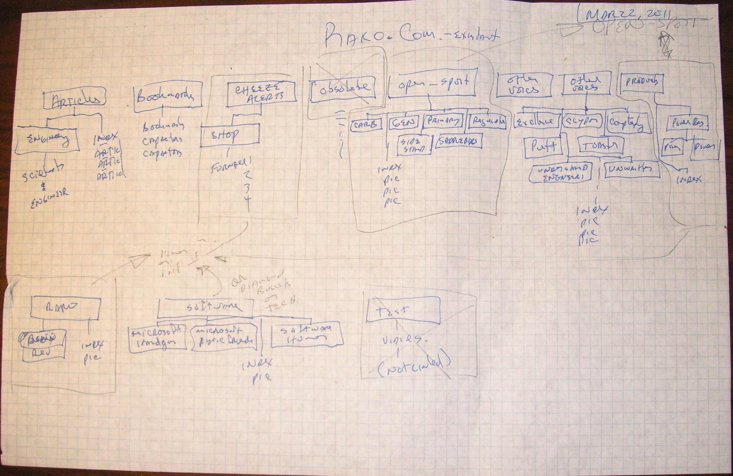
 I like designing things on B-size, also called ledger size paper. Staples has nice 11x17 graph paper. The first task was to draw up the structure of the existing rako.com site. The proposed drawing shows that there will be 8 "blogs" in the site. That does not mean 8 idiots blithering about their cats. It means there will be 8 sub-directories with their own index page, archive page (what MT calls "contents") and its own style-sheet. The "Masthead" and "Contents" sub-directories will be created by the root website install of movable type. Each blog in a MT website is given a number by the software when you create it. MT must us ID=1 for he root website, since the first blog I created, "Archive" was given blog ID #2. So I had to bump all the numbers by one as I created each of the 8 blogs and 8 subsequent sub-directories. |
 |
  |
| On the right side of the page I mapped the blog
names to a sub-directory, keeping the name as short as possible. I use
capitalization in sub-directories to improve readability of the URL
(Uniform Resource Locator). At the bottom right I account for mapping
old content into the new structure. You can see I was once stupid enough
to have a space on the URL with "Other Voices". You can also see I left
those pages up but replicated them in a directory "Other_Voices". I
will put that content in one of the new sub-directories but I will leave
both of those old sub-directories on the web server so any traffic
Google drive to them will not get dead-ended to a 404 page. [Update] After creating the 8 blogs called out in the above drawing, I decided it would be nice if the Masthead was a blog instead of a page created by the root site engine. My thinking was that I could make an entry for each person that helped me or taught me something. Then the Masthead/index.html pages would be the roll-up of those people. I could also have a Contents html page if I desire to separate the contributors by category, family, friend, author, boss, protege etc. So after populating and entry or two in all the blogs except Archive, I added a Masthead blog that I can put down my influences. [Update 2, 2018: I redesigned the whole site, with three blogs, Design, Media, and Journal. This corresponds to the new name, Rako Studios. This subsumes both the product designs and the media we create, with a Journal section to document the day-by-day fun of life in general. |
 |
  |
This post is in these categories: |  |
  |